Luxe Magazine: July/August 2020
Written by Paige Porter Fischer | Photography by Joshua McHugh
Designer Terri Ricci never underestimates a game of pretend. With a sincere belief that her best projects result from good storytelling, Ricci invited her Aspen clients to imagine their future life in the home they were building. The couple had purchased a stunning piece of property—and the architectural plans that came with it—but wanted Ricci to tailor the plans to fit their laid-back lifestyle. Though the blueprint promised a sophisticated home with incomparable mountain and valley views, the clients, who love to entertain, wanted to ensure the home would also envelop friends and family with a warm aesthetic that says, “Welcome.”
In order to inform design decisions, Ricci started by asking the clients to give her a glimpse inside their imagined future life here. “The wife described what she would be serving during meals and who would be coming over to enjoy this space—how they would arrive, what they might be wearing, what the lighting would feel like, and where the kids would start and end up,” recalls Ricci. “It was her way of being able to visualize.”
Luxe Magazine July/August 2020 Cover Story. Interior Design by Terri Ricci
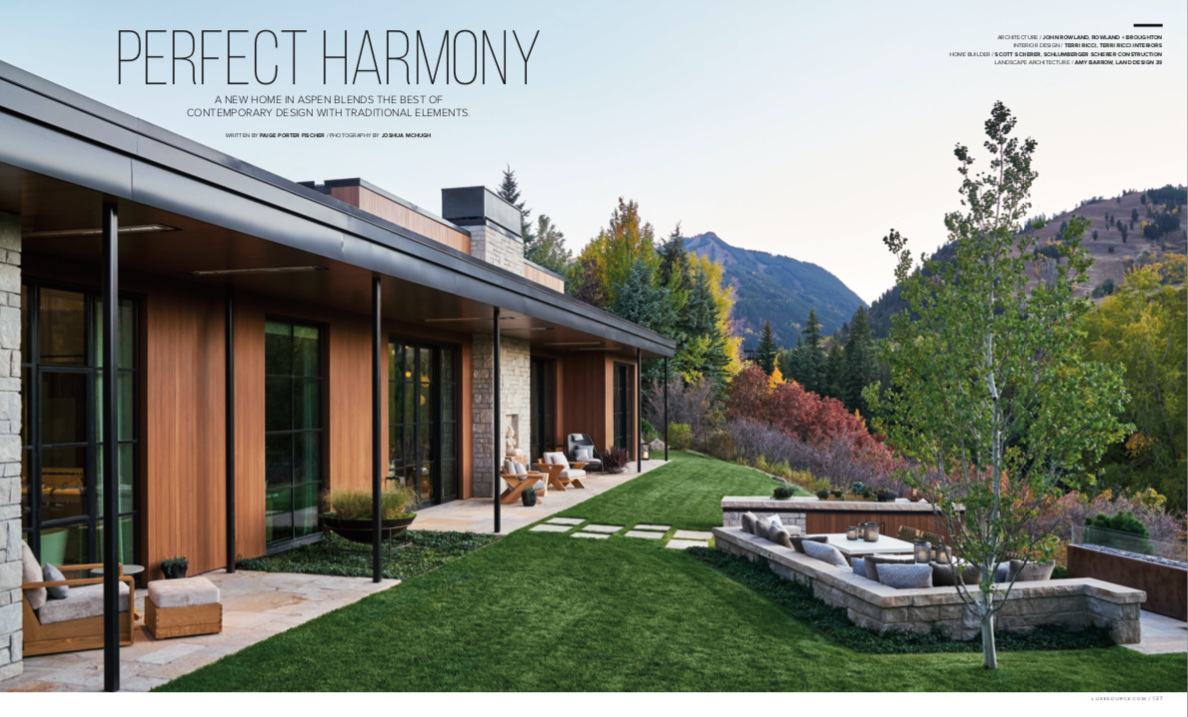
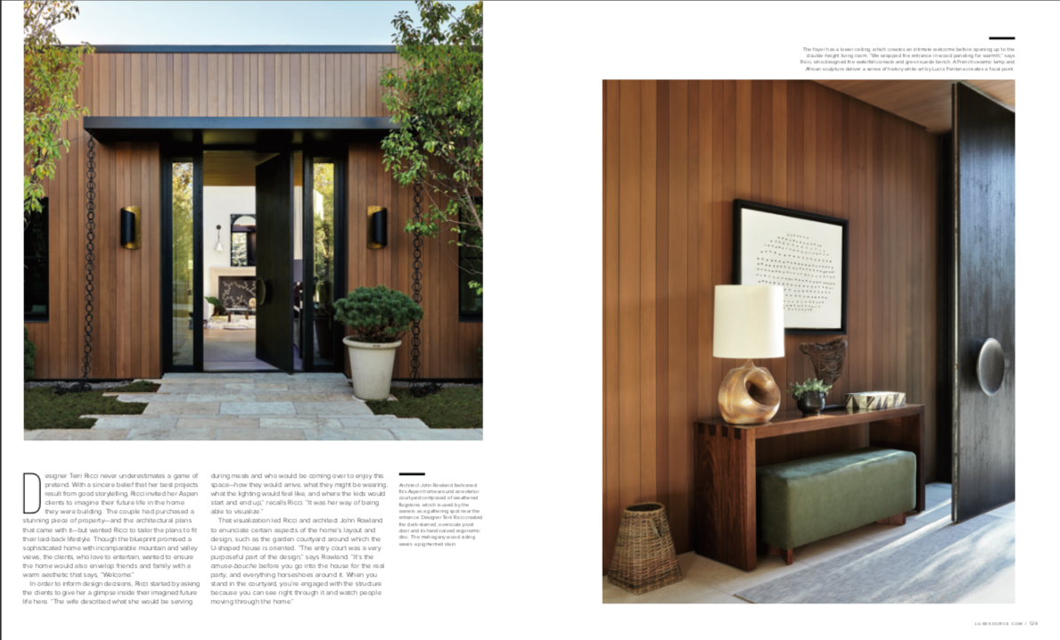
That visualization led Ricci and architect John Rowland to enunciate certain aspects of the home’s layout and design, such as the garden courtyard around which the U-shaped house is oriented. “The entry court was a very purposeful part of the design,” says Rowland. “It’s the amuse-bouche before you go into the house for the real party, and everything horseshoes around it. When you stand in the courtyard, you’re engaged with the structure because you can see right through it and watch people moving through the home.”
Architect John Rowland fashioned this Aspen home around an exterior courtyard composed of weathered flagstone, which is used by the owners as a gathering spot near the entrance. Designer Terri Ricci created the dark-stained, overscale pivot door and its hand-carved ergonomic disc. The mahogany wood siding wears a pigmented stain.
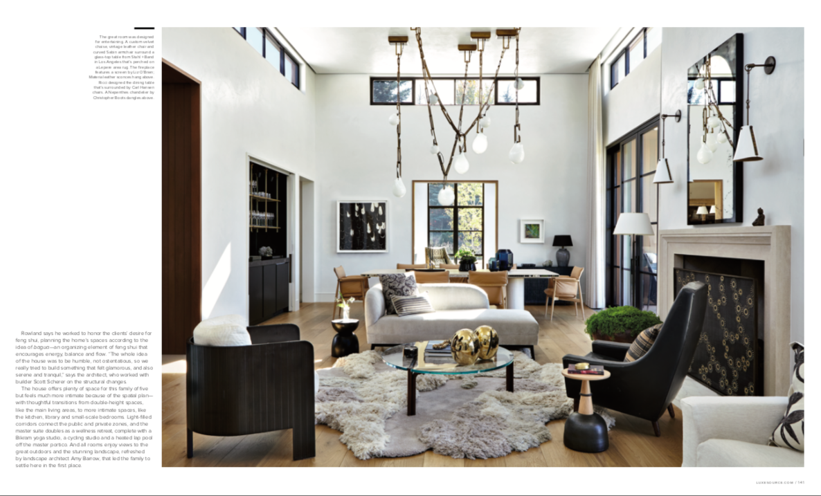
Rowland says he worked to honor the clients’ desire for feng shui, planning the home’s spaces according to the idea of bagua—an organizing element of feng shui that encourages energy, balance and flow. “The whole idea of the house was to be humble, not ostentatious, so we really tried to build something that felt glamorous, and also serene and tranquil,” says the architect, who worked with builder Scott Scherer on the structural changes.
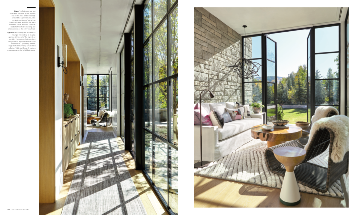
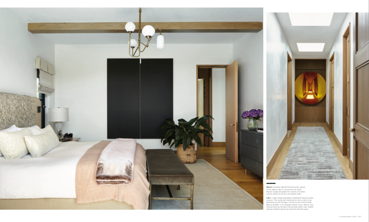
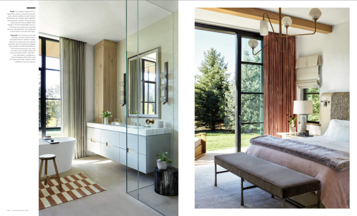
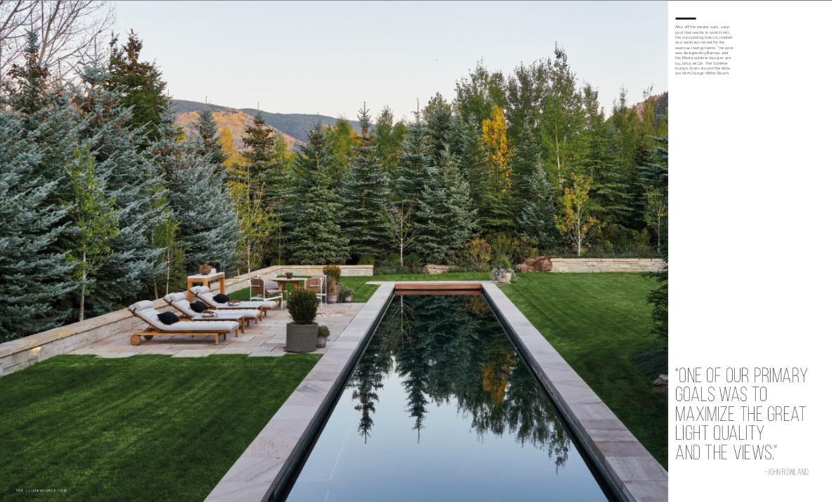
The house offers plenty of space for this family of five but feels much more intimate because of the spatial plan— with thoughtful transitions from double-height spaces, like the main living areas, to more intimate spaces, like the kitchen, library and small-scale bedrooms. Light-filled corridors connect the public and private zones, and the master suite doubles as a wellness retreat, complete with a Bikram yoga studio, a cycling studio and a heated lap pool off the master portico. And all rooms enjoy views to the great outdoors and the stunning landscape, refreshed by landscape architect Amy Barrow, that led the family to settle here in the first place.
Ricci was enamored with the layout from the very beginning. “It’s so inviting, especially for a family with children,” says Ricci. “All of their bedrooms are on one level, but in different zones, which is appealing. There’s a seamless transition from inside to the outside, with massive steel windows and doors creating a sense of transparency—an easy flow from one corner of the house to the next. Light passes through the house at all points of the day, uniting the spaces. My goal was to design the rooms to enhance that flow and create visual continuity.”
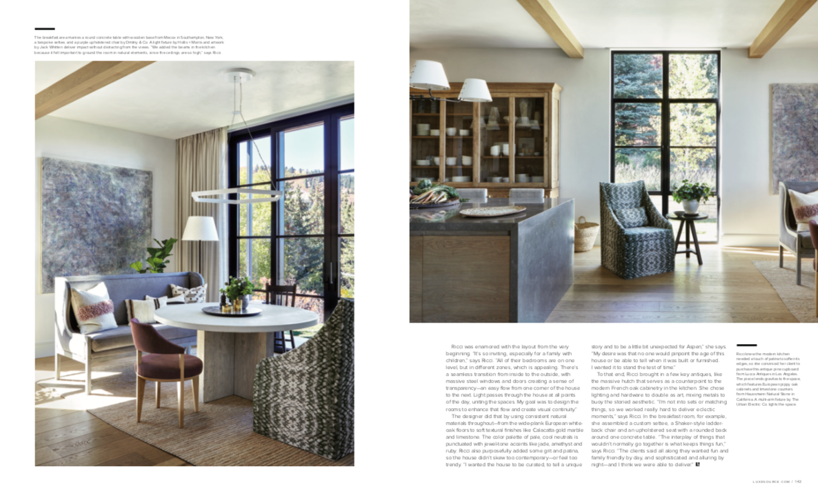
The designer did that by using consistent natural materials throughout—from the wide-plank European white- oak floors to soft textural finishes like Calacatta gold marble and limestone. The color palette of pale, cool neutrals is punctuated with jewel-tone accents like jade, amethyst and ruby. Ricci also purposefully added some grit and patina, so the house didn’t skew too contemporary—or feel too trendy. “I wanted the house to be curated, to tell a unique story and to be a little bit unexpected for Aspen,” she says. “My desire was that no one would pinpoint the age of this house or be able to tell when it was built or furnished. I wanted it to stand the test of time.”
To that end, Ricci brought in a few key antiques, like the massive hutch that serves as a counterpoint to the modern French oak cabinetry in the kitchen. She chose lighting and hardware to double as art, mixing metals to buoy the storied aesthetic. “I’m not into sets or matching things, so we worked really hard to deliver eclectic moments,” says Ricci. In the breakfast room, for example, she assembled a custom settee, a Shaker-style ladder- back chair and an upholstered seat with a rounded back around one concrete table. “The interplay of things that wouldn’t normally go together is what keeps things fun,” says Ricci. “The clients said all along they wanted fun and family friendly by day, and sophisticated and alluring by night—and I think we were able to deliver.”

